| Version 10 (modified by memespring, 3 years ago)
(diff) |
|---|
|
--
|
Redesign Notes - Package page
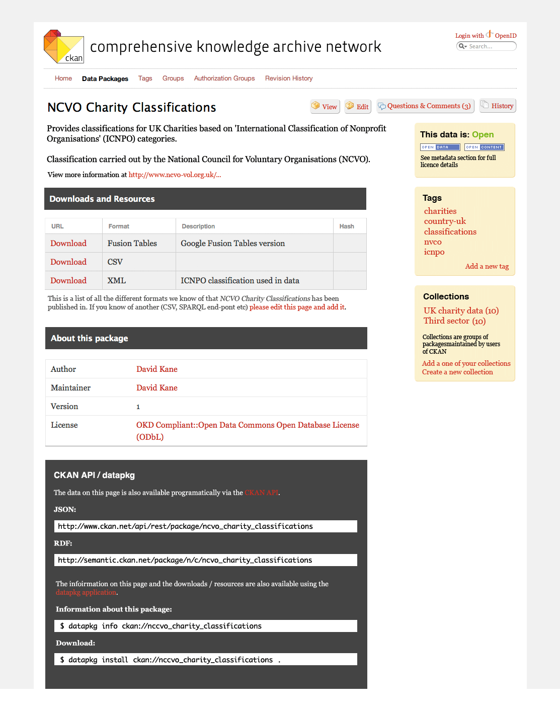
- Ratings is rating really much use? It's hard to know what is being rated - quality, openness, interestingness, format. Suggest removing and focus on comments / discussion.
- Comments - Suggest move to a separate tab and rename 'Questions and Comments'
- Comments - Display number of comments on button to draw user in
- Comments - Add hint to new page suggesting what sort of comments/questions people should make
- Getting the data - Can we make the download (Resources) section clearer or more prominant? This seems to be the primary purpose of this page for a casual user.
- Getting the data - 'resources' is unclear term, just call it 'Downloads & Resources?'
- Getting the data - Add a hint explaining what they are.
- Groups - Suggest renaming collections so users get the message they are curated
- Tags - Should be able to add a tag directly via ajax (as per flickr)
- Title - Name of package gets lot in the buttons (edit etc) and the package slug id
- Buttons - move to top right
- API / package slug - Create new API section the explains the slug id and how to access via datapkg etc
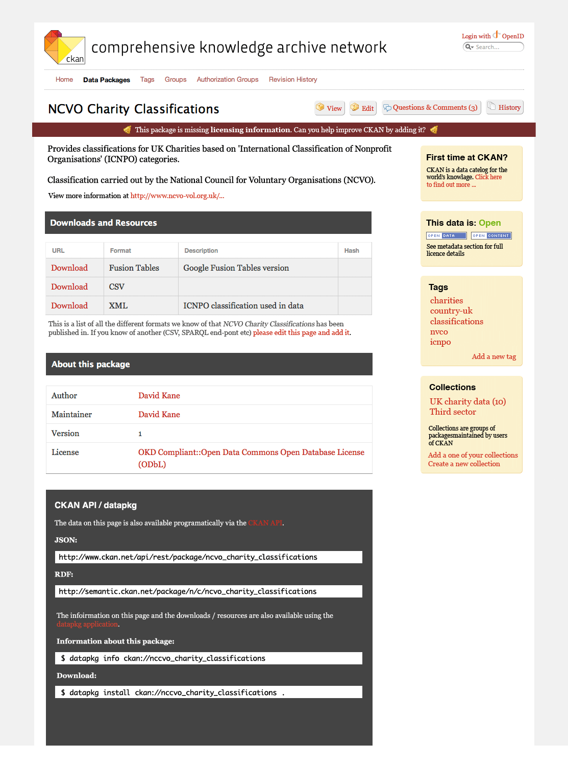
- Completeness - If a package is missing a description / licence / download then display a prominent message in the header asking passing users to add the missing info
- Meta data - rename 'About this package' and collect all such data into a single table
- New users - add a welcome / intro message if users are new to ckan (cookie)
Example mockup - second pass (excludes optional UI items)

Example mockup - second pass (includes optional UI items)

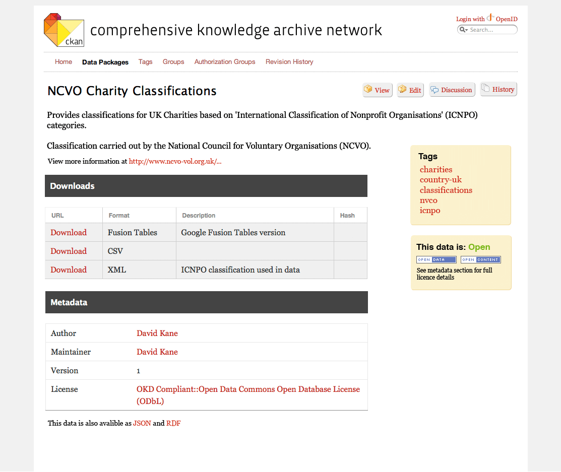
Example mockup - first pass

Download in other formats:

