Last modified 3 years ago
Last modified on 12/01/10 16:07:54
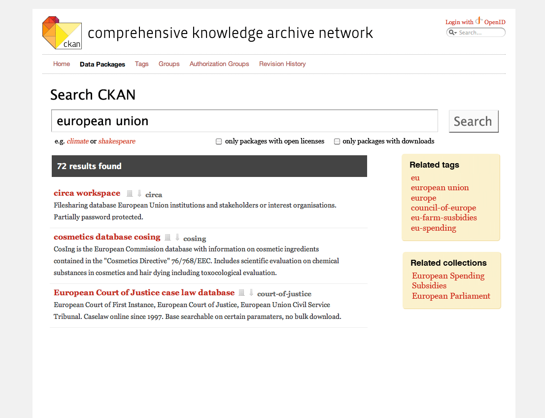
Design notes - search results page
- Tags - Move related tags to the sidebar confuses the purpose of the page having them as part of the results
- Pagination - Remove the top pagination control. Standard behaviour is scroll down -> next scroll down ->next
- Results - Display tags for each package inline to help use choose which once to click through
- Search box - make each example in the "E.g. 'geo', 'shakespeare', 'science'" links
- Resources icons - Not very useful as a link. Better to display inline the number of resources available
- Filters - 'downloadable' isn't a term used elsewhere. Change to 'Packages with downloads or other resources'
- Filters - explain 'open license' better
- Results make use of a:visited to help browsing
- No results - better call to action to add a package e.g. 'Do you know of a dataset relating to $search_term? help improve CKAN by adding it'
- No results - 'No results' and '0 packages found' are displaid, choose one.
Attachments
-
ckan-search.png
(45.5 KB) -
added by memespring 3 years ago.
search mockup 1

